Best MacBook and Mac Themes 2026: Customize macOS Tahoe
Every price in this guide was checked against the vendor’s own page on August 26, 2026. Many vendors in this category run a permanent discount countdown, so the figure at checkout is a promotional one and moves; where a vendor publishes no price on its own site, this guide says so rather than guessing.
macOS still does not hand you a theme picker the way KDE Plasma or even Windows 11 does. What it does give you, since macOS 26 Tahoe, is a far larger set of official knobs than most customization guides account for: icon styles, folder colors, and a clear-or-tinted setting for the entire Liquid Glass layer. The third-party ecosystem then works around the edges of that system. Used together, those two layers can produce a desktop that looks nothing like the factory default.
This guide covers the full stack: the history that explains why macOS looks the way it does, the specific tools worth installing today, a step-by-step process for the most impactful changes, and an honest look at where the limits are.
How macOS Design Has Evolved: From Aqua to Liquid Glass
macOS has gone through four distinct visual eras, and understanding them helps you decide which aesthetic direction to chase. Each era left behind usable assets, wallpapers, and icon styles that the community still remixes.
Aqua (Mac OS X 10.0 Cheetah through Tiger 10.4, 2001-2005) is the candy-colored, hyper-glossy era. Buttons looked like wet glass, the Dock had a reflective shelf, and everything had a blue or graphite tint. The design was explicitly meant to make people want to lick the screen, in Steve Jobs’s words. Fan recreations of Aqua-style desktops remain popular on sites like Dribbble.
Skeuomorphic (Leopard 10.5 through Mountain Lion 10.8, 2007-2012) layered real-world textures over the Aqua base. iCal showed stitched leather, Notes looked like a legal pad, and the Finder sidebar used linen. This era is divisive: some users find it warm and tactile; others consider it cluttered.
Flat (Yosemite 10.10 through Catalina 10.15, 2014-2019) stripped the textures and went translucent. Jony Ive’s influence pushed macOS toward iOS visual language. The Dock became a flat shelf, sidebars turned frosted glass, and the system font switched to Helvetica Neue, then San Francisco.
Neumorphic/Rounded (Big Sur 11 through Sequoia 15, 2020-2025) introduced larger corner radii, full-height sidebars, and a more iOS-aligned icon grid. macOS Big Sur specifically introduced what designers called a neumorphic quality: soft shadows and extruded shapes that suggest depth without using gradients. Community discussion confirms that this transition is controversial. A recurring complaint is that this design lacks clear active-window indication compared to the Mavericks era, and that the rounded corners on some UI panels reduce information density.
Liquid Glass (Tahoe 26, 2025-present) is the first full visual overhaul since Big Sur. Apple rebuilt the system chrome around a translucent material that refracts what sits behind it, which is why menu bars, sidebars, and the Dock render differently than they did on Sequoia. This era differs from the previous four in one important way: it shipped with user-facing controls attached, so you can set the Liquid Glass look yourself instead of accepting Apple’s default.
The Best Mac Themes and Aesthetic Directions in 2026
A “Mac theme” is not a single downloadable file. It is a combination of a wallpaper, an icon set, a color scheme, a widget layout, and optionally a modified Dock or menu bar. The four most popular aesthetic directions right now are:
Minimal Dark. A near-black or deep navy wallpaper, monochrome or single-accent icon set, hidden menu bar, and auto-hiding Dock. This setup is the most popular on productivity-focused setups because it reduces visual noise during long coding or writing sessions.
Retro Aqua Revival. Recreates the Mac OS X 10.3-10.4 Panther/Tiger look using archived Aqua wallpapers, glossy icon packs from sources like macOSicons.com, and the Dock set to magnification with a 3D shelf effect (still available in System Settings under Dock and Menu Bar on macOS Ventura and later).
Pastel Aesthetic. Popularized by the MacBook customization community on Pinterest and YouTube, this pairs soft-toned wallpapers (peach, sage, lavender) with custom folder icons in matching colors. The Aesthetic Background Themes app on the Mac App Store targets exactly this audience, offering bundled wallpapers, folder icons, widgets, and cursor effects in coordinated palettes.
High-Contrast Accessibility. Uses macOS’s built-in Increase Contrast mode (System Settings, Accessibility, Display) combined with a dark wallpaper and large-text widgets. This is underserved in most theme guides but genuinely improves usability for users sensitive to the current design’s low visual separation between UI layers.
What macOS Tahoe 26 Changed: Apple’s Own Theming Controls
Part of what used to require a third-party app now ships with the system, and any customization guide written before late 2025 understates what the free baseline covers. Open System Settings > Appearance on macOS Tahoe 26 and the pane offers (Apple Support):
- Liquid Glass, set to either clear or tinted. This governs how translucent the system chrome renders across the whole OS.
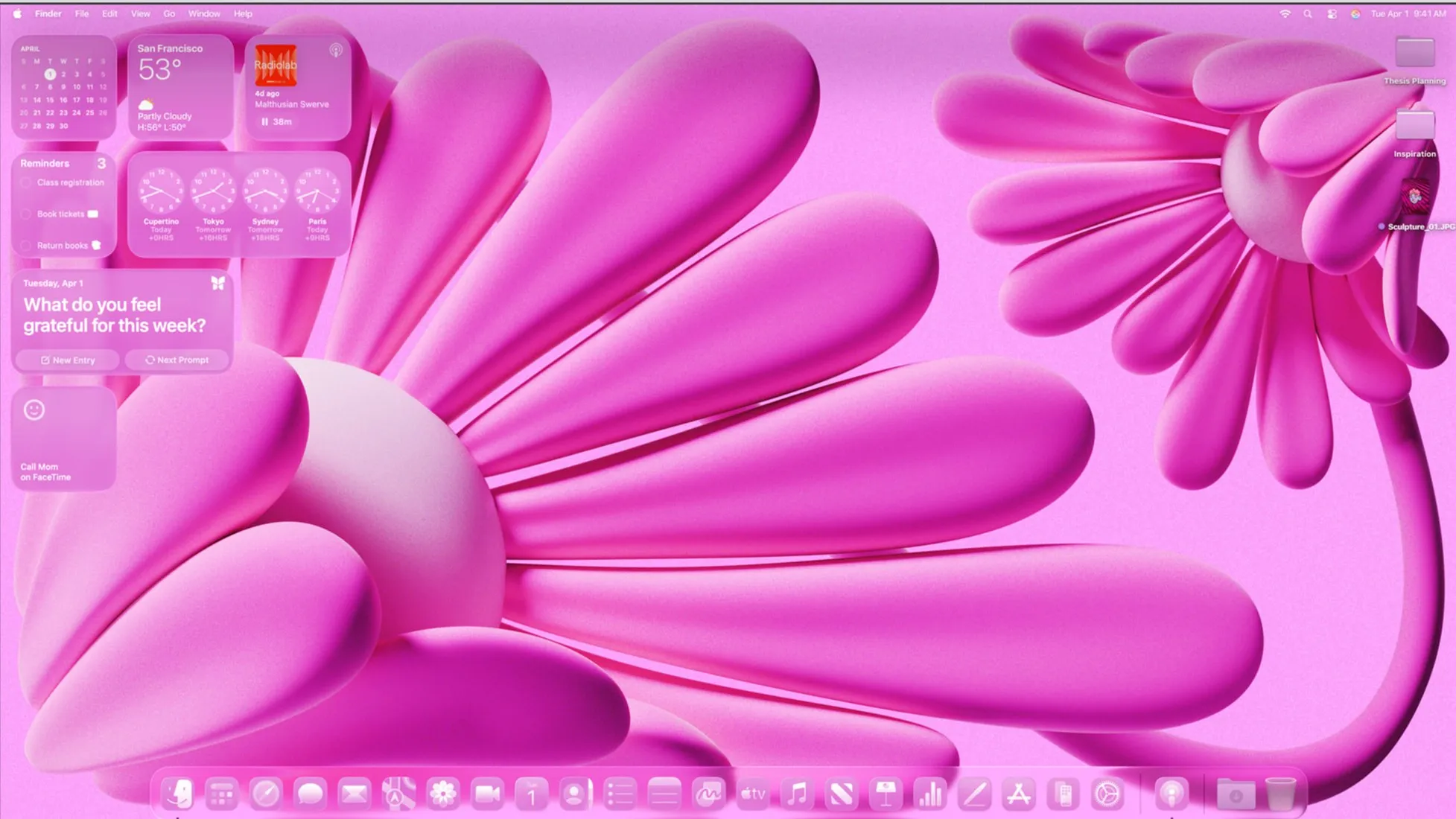
- Icon & widget style, with four options: Default, Dark, Clear, and Tinted. Each can be set to apply Always or Auto, so your icons can follow the light/dark schedule instead of staying fixed.
- Folder color, which sets the default Finder folder tint system-wide. Selecting the Tinted style merges this into a single Icon, widget, and folder color control.
- Tint window background with wallpaper style, which pulls colors out of your wallpaper and applies them behind window areas.
- Text highlight color and Sidebar icon size, for selected text and sidebar density respectively.
Individual folders can be recolored without any download. Select a folder in Finder, click the Action button, choose Customize Folder, then pick a colored circle, a symbol, or an emoji (Apple Support). To use your own artwork instead, copy an image in Preview, select the folder, choose File > Get Info, click the small icon at the top of the Info window, and paste. System folders (Applications, Library, System, Users) cannot be customized; your Home folder can.
What this changes practically: the Pastel Aesthetic direction above used to mean installing Pictogram and hunting down a matching icon set, and much of it is now reachable with Tinted icons, a folder color, and a coordinated wallpaper. Third-party tools still win where Tahoe does nothing, which is specific icon artwork rather than a system-applied tint, desktop widgets, and menu bar management.
Essential Tools for macOS Theming: Free and Paid
None of the tools below require disabling System Integrity Protection. Prices were checked against each developer’s own page in August 2026, because several widely-copied roundups (including an earlier version of this one) list figures that are simply wrong.
| Tool | Cost (checked Aug 2026) | What It Changes | Stated macOS support |
|---|---|---|---|
| Übersicht | Free, open source | Desktop widgets (HTML/JS) | No Tahoe statement; last repo commit Dec 2023 |
| Pictogram | Free | App and folder icons | macOS 11.0 or newer |
| HiDock | Free, donations accepted | Dock settings per display arrangement | macOS Monterey or later |
| Dynamic Wallpaper Club | Free (a website, not an app) | Time-shifting wallpaper downloads | Not applicable |
| Aesthetic Background Themes (App Store) | Free download, then $10.99/mo to $36.99/yr | Wallpapers, icons, widgets, cursors | macOS 11.0 or later |
| Bartender 6 | From $12 one-time, 4-week trial | Menu bar icon management | Built for Tahoe and Sequoia |
| TopNotch | Free | Hides notch on notched MacBooks | macOS 11.0 or newer |
One caveat applies to most of this table: a stated minimum of “macOS 11.0 or newer” is a floor, not a promise that anyone tested the app on Tahoe. Bartender is the only tool here whose developer publishes an explicit current-OS position. Check the download page before you rely on any of the others.
For visual impact at zero cost, Pictogram plus a free Übersicht widget pack is still the combination to reach for, and both are genuinely free rather than free-tier. Übersicht comes with a caveat worth stating plainly, because no other roundup seems to: the last commit to its public repository was in December 2023, titled “Fix Screen Handling on Sonoma”. That is two macOS releases ago, on a tool whose whole job is drawing to the desktop layer that Liquid Glass rewrote. It may well still work fine, and plenty of people are still running it, but install it knowing nobody is on the other end if Tahoe breaks something. HiDock is also free and does one narrow thing well, which is remembering different Dock settings for different display arrangements. Aesthetic Background Themes needs a specific warning: the download is free, but the coordinated theme packs sit behind subscriptions running from $10.99 per month to $36.99 per year, which is a lot for wallpapers and folder icons that Tahoe’s own Folder color control now partly replaces.
How to Customize Your MacBook or iMac: Step-by-Step
The sequence below moves from zero-risk changes to progressively more involved ones. Complete each stage before moving to the next.
Stage 1: System Settings Changes (No Third-Party Apps)
- Open System Settings, go to Appearance. Set mode to Dark, Light, or Auto. Choose an accent color from the built-in swatches, or pick a custom color in macOS Sonoma 14 and later. On Tahoe 26, also set Icon & widget style and Folder color here before installing anything, since they may cover what you were about to download an app for.
- Go to Wallpaper. Click the plus button to add any image. For dynamic wallpapers that shift with the time of day, choose any of Apple’s built-in “Dynamic” options or add a custom .heic dynamic wallpaper file.
- Go to Dock and Menu Bar (Ventura) or Desktop and Dock (Sonoma and later). Enable magnification, set the Dock size to your preference, and toggle “Automatically hide and show the Dock” for a cleaner look.
- Go to Accessibility, then Display. Try “Reduce Transparency” if the frosted-glass sidebars feel visually busy. Enable “Increase Contrast” for sharper UI borders.
- Go to Control Center and customize which items appear in the menu bar.
Stage 2: Replace Icons with Pictogram
- Download Pictogram from the developer’s site (pictogramapp.com) or the Mac App Store.
- Open Pictogram and drag any app or folder onto its window. The app reads the current icon and lets you replace it with any .icns or .png file.
- Download a free icon set. macOSicons.com hosts over 10,000 community-made icons compatible with macOS. Search by app name and download the .icns file.
- Drag the downloaded icon onto the app in Pictogram and click Apply. The change takes effect immediately without a restart.
One Tahoe-specific reason this stage matters more than it used to: macOS 26 wraps app icons that were not rebuilt for its new icon format in a grey rounded container, which shrinks the actual artwork and makes it harder to recognise. If your Dock filled up with grey boxes after upgrading, that is what happened, and replacing those icons by hand is currently the fix. Look for icons described as squircle or Tahoe-ready on macOSicons.com so the replacement matches Apple’s current shape rather than getting boxed as well. Manual icon changes are still lost when an app updates, so this is maintenance, not a one-time job.
Stage 3: Add Desktop Widgets with Übersicht
- Download Übersicht from tracesof.net (free, open source).
- Open Übersicht. It creates a widget folder at ~/Library/Application Support/Übersicht/widgets.
- Browse the Übersicht widget gallery at tracesof.net/uebersicht-widgets. Download a widget folder and place it in the widgets directory. Übersicht auto-loads it.
- Edit the widget’s .jsx or .coffee file in any text editor to adjust colors, fonts, and position to match your chosen palette.
Stage 4: Refine the Menu Bar
A menu bar manager hides, rearranges, and groups menu bar icons, clearing the clutter that builds up once you run several background apps. Bartender is the best known option, and it supports menu bar profiles, so you can switch between a minimal focus layout and a full monitoring layout with a keyboard shortcut. Two things are worth knowing before you buy it.
Get the version right. The vendor states plainly that “Bartender 5 is not compatible with macOS Tahoe. To use Bartender on Tahoe, update to Bartender 6” (Bartender 5 release notes). Bartender 6 is a one-time purchase starting at $12 with a four-week trial that needs no card. Any guide still telling you to buy Bartender 5 for a current Mac, including earlier versions of this one, is out of date.
Know who owns it. Bartender changed hands quietly in 2024. Original developer Ben Surtees confirmed he had sold the app to Applause around three months before the news surfaced, and it surfaced without a formal announcement. AppleInsider reported that the Amplitude analytics framework, which includes location data, was added in version 5.0.52 where it had not existed before, and that the code signature shifted to App Sub 1 LLC in April 2024 and then to Bartender App LLC in May. No malware was ever found, and security researcher Patrick Wardle, who was widely cited at the time, later clarified he had not really examined the app for malicious code. Still, a menu bar manager needs Accessibility and Screen Recording permissions, which are two of the most sensitive grants on macOS. Read the current privacy policy before granting them. This is the most optional stage in this guide, so skipping it costs you very little.
iPhone customization options that pair well with a unified Apple aesthetic
Light Mode vs. Dark Mode: The Honest Comparison
Light mode and dark mode are not simply personal preference choices. Each has measurable trade-offs depending on your hardware and environment.
| Factor | Light Mode | Dark Mode |
|---|---|---|
| OLED battery savings | None (LCD panels) | Significant on OLED iPhones; MacBooks use LCD/mini-LED |
| Eye strain in bright rooms | Lower (matches ambient light) | Higher (contrast reversal in daylight) |
| Eye strain in dark rooms | Higher | Lower |
| Text legibility on default fonts | Slightly higher for most users | Slightly lower at small sizes |
| App compatibility | Universal | Some older apps render poorly |
| Wallpaper visibility | Better with light wallpapers | Better with dark wallpapers |
A common complaint in the user community is that neither extreme is comfortable for all-day use: light mode is too bright at maximum display brightness, and dark mode creates halation around white text on pure-black backgrounds. The practical fix is to use Auto mode (switches at sunset/sunrise), reduce display brightness by 20-30% in light mode, and choose a dark grey wallpaper (hex #1a1a2e or similar) rather than pure black in dark mode.
macOS does not offer a true “grey mode” or mid-tone system theme natively. The closest workaround is enabling Reduce Transparency in Accessibility settings, which replaces the frosted-glass effect with solid grey panels and produces a noticeably more neutral, less polarized look.
Advanced Customization: Accent Colors, Cursors, and Fonts
Custom Accent Colors
macOS Sonoma 14 and later allow a fully custom accent color beyond the 10 presets. In System Settings, Appearance, click the color swatch at the end of the row to open the color picker. This color applies to buttons, checkboxes, progress bars, and selected text highlights across the entire system.
Cursor Customization
macOS Monterey 12 introduced cursor color customization in System Settings, Accessibility, Display. You can set independent fill and outline colors. The Aesthetic Background Themes app extends this with animated cursor effects, though those require its runtime to be running in the background.
System Font Considerations
Apple’s San Francisco font is baked into the system and cannot be replaced without disabling SIP. However, individual apps that respect user font preferences (including most text editors and email clients) can be set to any installed font. For coding environments, switching Visual Studio Code’s editor font to a Nerd Font variant (JetBrains Mono, Fira Code) is a low-effort change that dramatically alters the feel of a developer-focused desktop.
Spotlight and Stage Manager
Stage Manager, introduced in macOS Ventura 13, changes how windows are grouped and displayed. Enabling it (Control Center, Stage Manager) gives the desktop a more structured, card-based look that some users find closer to a tiled window manager aesthetic. It pairs well with a minimal dark theme because the window groupings become the dominant visual element.
how the latest MacBook Pro hardware affects display and theme rendering
Troubleshooting Common Theming Issues
Icons revert after an app update. This is expected behavior. When an app updates, macOS restores the original icon bundle. Pictogram includes an auto-restore feature that re-applies your custom icon after an update is detected. Enable it in Pictogram’s preferences.
Widgets disappear after a restart. Übersicht must be set to launch at login. Open System Settings, General, Login Items, and add Übersicht to the “Open at Login” list.
Menu bar icons reappear after Bartender hides them. Some system agents (VPN clients, cloud sync tools) force their icons to the visible area. Bartender 5’s “Always Hidden” rule overrides most of these, but a handful of apps with high system privileges ignore it. The workaround is to disable the app’s menu bar icon in its own preferences if that option exists.
Dark mode makes some apps look broken. Apps built with older AppKit frameworks may not fully support Dark Mode. The fix is to force-launch the specific app in light mode: right-click the app in Finder, Get Info, and check “Open in Low Resolution” is off, then use the terminal command defaults write com.appbundleid NSRequiresAquaSystemAppearance -bool YES, replacing com.appbundleid with the app’s actual bundle identifier.
Wallpaper appears washed out on ProMotion displays. MacBook Pro models with Liquid Retina XDR displays render wide-color (P3) images differently than sRGB images. Download wallpapers tagged as P3 or convert your preferred image using Preview’s Export function, selecting “Display P3” as the color profile.
Key Takeaways
- macOS customization works in layers: System Settings changes (free, zero risk) sit at the base, followed by icon packs, then widget engines, then menu bar managers. Each layer adds visual impact without requiring the next.
- Start with what Tahoe 26 already gives you. Icon & widget style, Folder color, and the clear-or-tinted Liquid Glass setting cover a lot of what used to need a download, and they cost nothing and grant no permissions.
- The four dominant aesthetic directions are Minimal Dark, Retro Aqua Revival, Pastel Aesthetic, and High-Contrast Accessibility. Each suits different workflows and hardware.
- Pictogram and Übersicht are both free outright, and together they cover most of what people want without touching System Integrity Protection.
- Neither light mode nor dark mode is universally superior. Auto mode combined with reduced transparency and a mid-tone wallpaper is the most comfortable all-day configuration for most users.
- Icon sets revert on app updates. Budget a few minutes after major app updates to reapply them, and on Tahoe pick squircle-shaped icons so macOS does not wrap them in its grey container.
Image credit: macOS Tahoe 26 desktop showing the Tinted icon and widget style, from Apple’s WWDC 2025 press materials, used for editorial illustration.
Frequently Asked Questions
Can you fully theme macOS like you can on Windows or Linux?
No, though the gap narrowed in 2025. Apple restricts access to core UI files in macOS, especially since System Integrity Protection (SIP) was introduced in OS X El Capitan 10.11, so replacing the entire window chrome or system font still requires disabling SIP and carries real security risks. What changed is the official surface area: macOS 26 Tahoe added system-wide icon and widget styles, folder colors, and a clear-or-tinted control for the Liquid Glass layer, none of which existed before. That is not a theme picker in the KDE sense, but it is considerably more than the “wallpaper and accent color” ceiling most guides still describe.
Are free macOS icon packs safe to install?
Icon packs distributed as .icns files or through apps like Pictogram are generally safe because they only modify folder and app icon resources, not system binaries. Always download from the developer’s official site or the Mac App Store. Avoid packages that require you to disable SIP or run unsigned scripts.
Does heavy customization slow down a Mac?
Wallpaper and icon changes have zero measurable performance impact. Widget engines like Übersicht run JavaScript and can add 1-3% CPU load depending on the number of active widgets. Dynamic wallpaper apps that cycle images on a schedule use negligible resources on Apple Silicon Macs. The main risk is app instability, not speed loss.
What is the best free tool for macOS desktop customization?
Übersicht remains the best-known free option for adding live widgets written in HTML and JavaScript directly to the desktop, though its repository has not seen a commit since December 2023. For icon replacement, Pictogram is the most straightforward modern tool, and it is free rather than free-tier. Neither requires disabling SIP, and neither developer publishes a macOS Tahoe compatibility statement, so check the download page before assuming current support.
How do I change folder colors on a MacBook?
On macOS 26 Tahoe you no longer need a third-party app. For every folder at once, open System Settings, go to Appearance, and set Folder color. For a single folder, select it in Finder, click the Action button, choose Customize Folder, then pick a colored circle, a symbol, or an emoji. To use your own image instead, copy it in Preview, select the folder, choose File > Get Info, click the small icon at the top of the Info window, and paste (Apple Support). System folders such as Applications, Library, System, and Users cannot be customized, but your Home folder can.
What happened to ShapeShifter for Mac theming?
ShapeShifter, developed by Unsanity, allowed system-wide UI theme replacement on Mac OS X through the PowerPC and early Intel era. It stopped working after Apple introduced 64-bit-only processes and tightened code signing in macOS Catalina 10.15. No direct successor exists that matches its depth of theming without disabling SIP.
Recommended reading
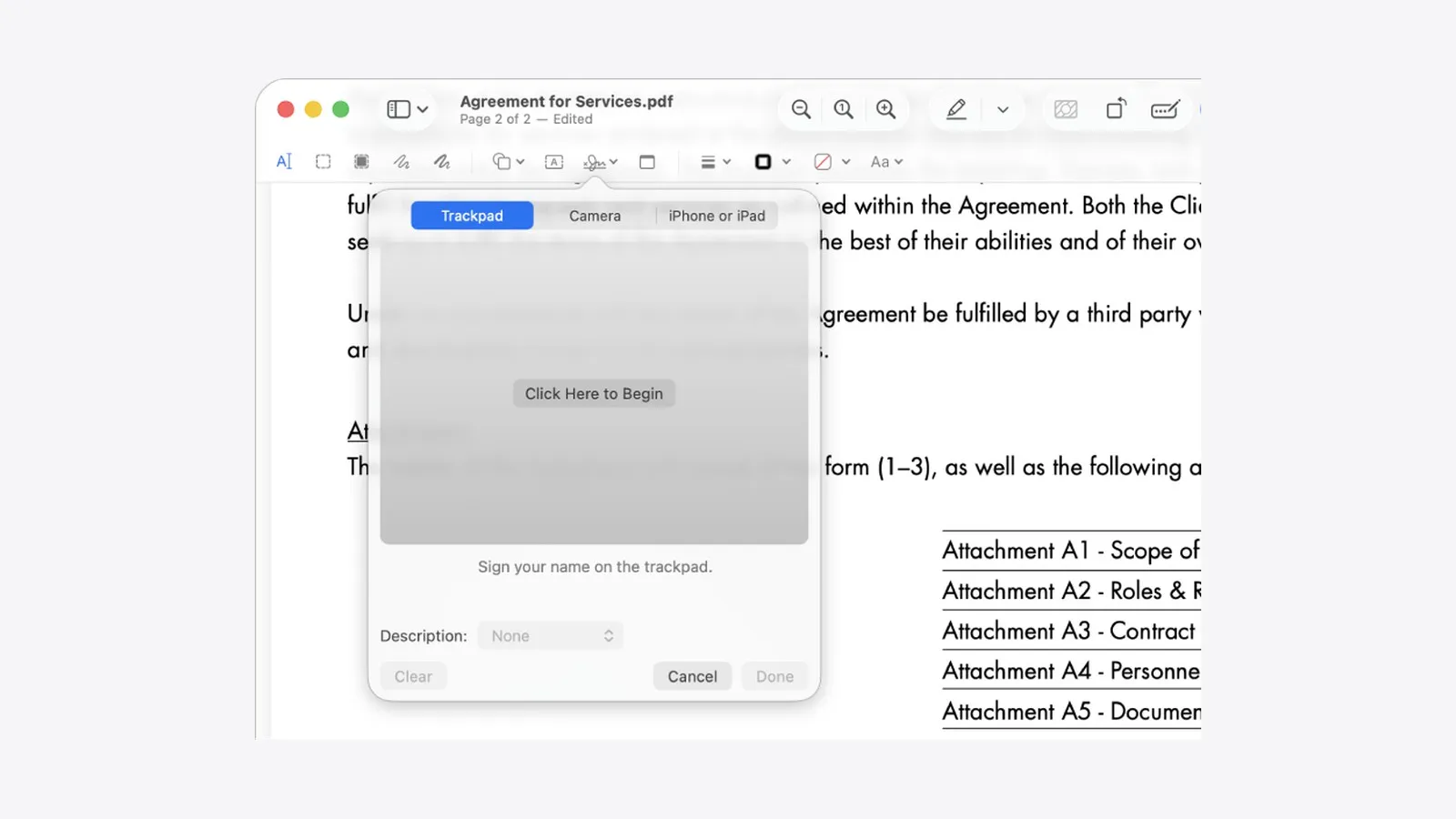
PDF Editors for Mac: What They Cost, and What Preview Already Does
What a Mac PDF editor really costs in 2026. Preview's exact limits, why every App Store listing says Free, and which tools are subscription, buy-once, or genuinely free.
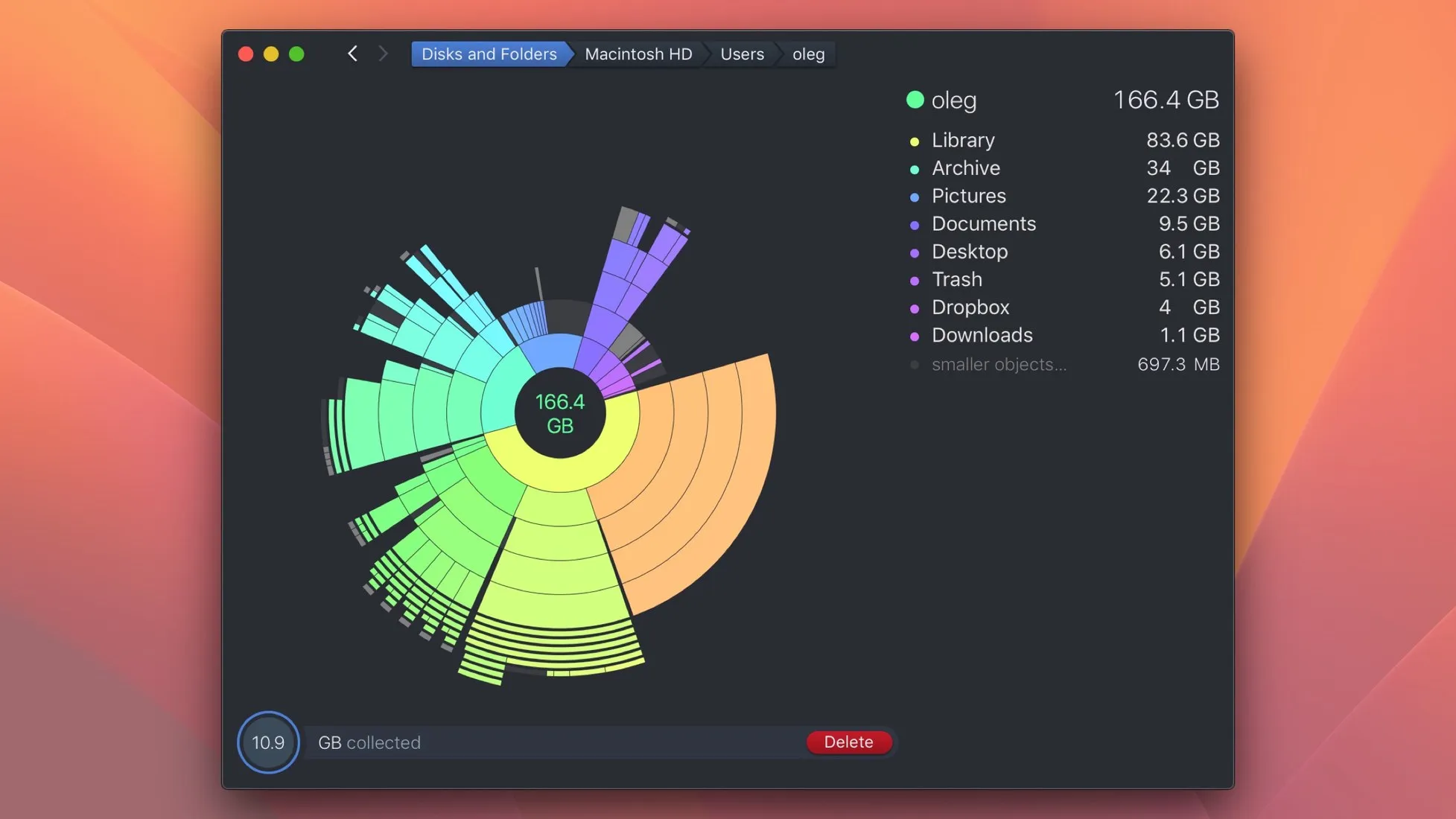
Mac Cleaner Apps in 2026: What Each One Costs and Removes
Mac cleaner apps in 2026 compared on price and on what they actually delete: the macOS built-in tools, free apps like OnyX and Mole, and the paid suites, including the checkout terms.
Mac Activity Monitor: How to Read CPU, Memory Pressure and Energy Impact
Learn to read Mac Activity Monitor like a pro: CPU, Memory Pressure, Energy Impact, and which processes are safe to quit in macOS 26 Tahoe.